Over the last few day's I have felt a little bit lost within each theme, and where to go with it next. I feel I have collated enough images at this moment and have a good understanding on what I'm trying to achieve within each theme, however needed to put this down onto paper!! and move colours and images around.
Below are Moodboards / Colour palettes for each theme. I decided before doing these, that I was not going to upload these to In Design, as I think the quality would not be great if I was to scan it in, however most of the images I have, and so I will be able to achieve a similar style and layout straight onto in design.
Concentrating on getting the mood board right has been such a helpful tool to now carry on with thinking about the pages of my trend book. This has definitely been a weakness so far, as I should have done this right from the start. I now have a better understanding of colour and mood to work from, and also feel more confident to start drawing fashion templates to work from within illustrator.
 |
| STREET |
I really wanted the colours of the decaying/distressed vibe to really show through. I think especially with the burnt orange, dusky browns and dark greys, this is evidenced well, and is clear with the imagery what I'm aiming for. I also wanted a bright coloured contrast to this, with the use of the yellow and off white. This is to link in with not only the idea of a decaying urban environment, but how street art is incorporated within this.
 |
| EGYPTIAN |
As the
vibrant colours and patterns are really evident with Egyptian culture, I really wanted this to be strongly shown within my moodboard. I wanted a completely different colour palette to be shown within this theme and to be noticeable the culture where these colours have evolved.
 |
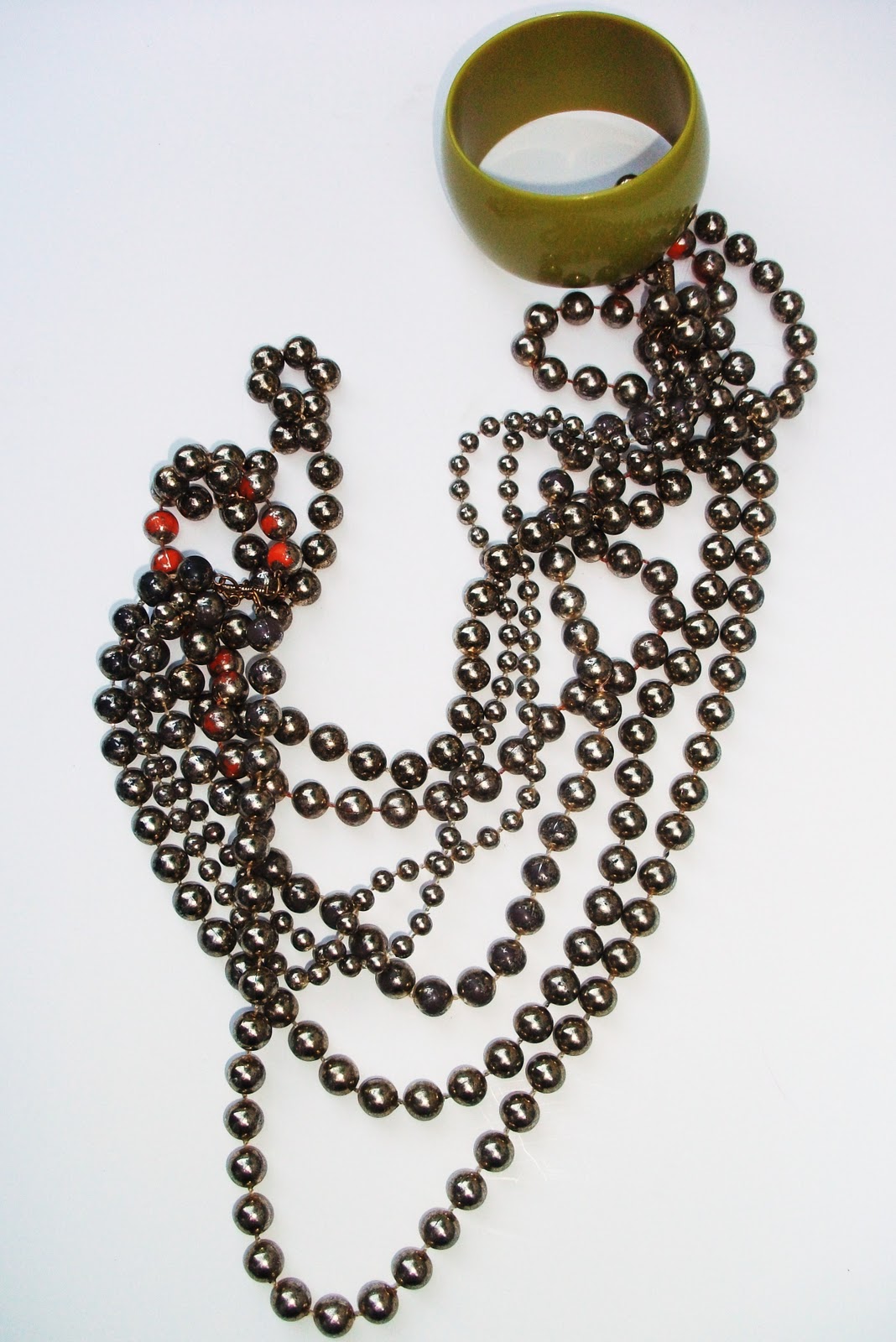
| DIY |
As shown, the cool icy colours along with the accessories is the most prominent part of the trend. I think with the pastel blues and pinks mixed with the bright orange and red add's the futuristic DIY style and modernism which I want to create.